Journey UX Case Study
By Rashid Mukhtar
Journey is a concept for a mobile app that I came up with as a part of the UX/UI design course at Pratt Institute. I was responsible for conducting the user research and testing as well as designing the UI. This case study summarizes the whole process.
PROBLEM
When planning to travel to a new destination, travelers have a hard time figuring out the places to see while they are in their destination. How might we help travelers discover the best places to see in their destination?
RESEARCH
User Interviews
I interviewed four people, all of whom travel several times a year. The goals of the interview were to understand how people plan their trips, how they discover places to see, which apps and websites they use, and to find out what challenges they face.
After conducting the interviews, I used my notes and audio recordings to create an affinity diagram, which helped me gather key insights from the interviews:
- People don’t have time to plan their trips / create an itinerary
- They want to find the top attractions in each destination
- They want to know what’s available when (business hours)
- They want to find nearby attractions while sightseeing
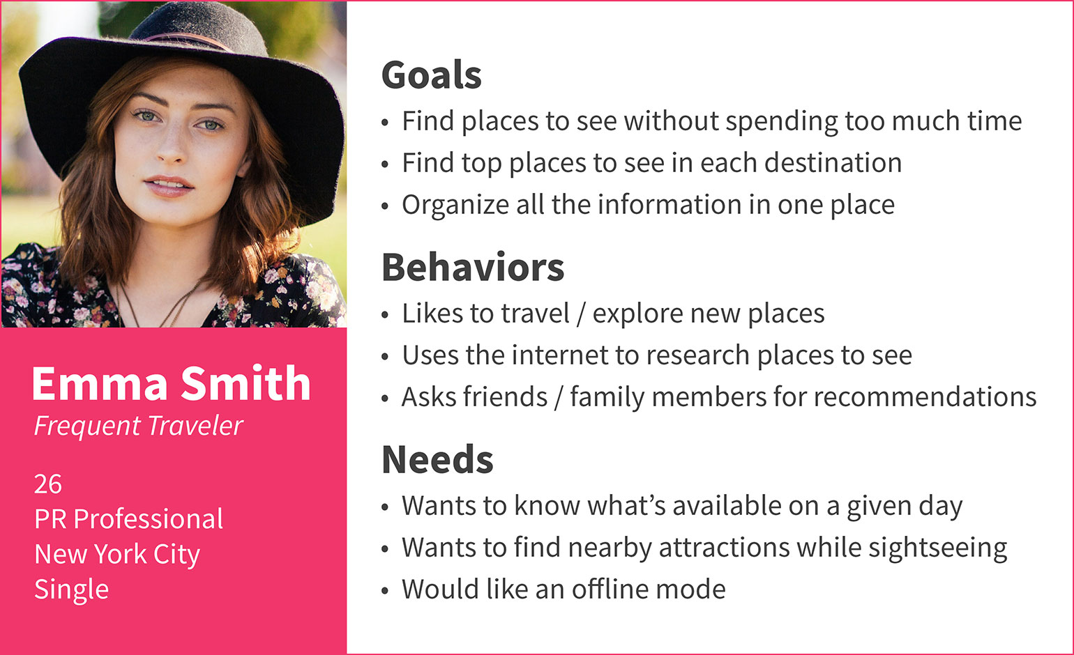
Persona
I created a user persona based on the data collected from the user interviews. Creating a persona helped me summarize what I learned from the interviews, and it allowed me to focus on solving user’s problems through my app.
Competitive Analysis
Google Trips and TripAdvisor are the two apps that were most frequently mentioned by the people that I interviewed. So I downloaded both apps on my phone and did a competitive analysis.
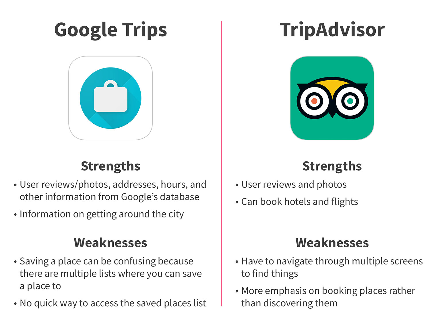
A major weakness both of these apps had was that they required users to browse through multiple screens before being able to find the list of places to see in a destination. This was something that I wanted to avoid in my app.
Revised Problem Statement
One of the key findings from the user interviews was that people don’t have enough time to plan their trips. So based on that finding, I revised my problem / how might we statement: How might we help travelers discover the best places to see in their destination without spending too much time?
PLANNING
Feature List
- A quick way to find the top attractions in each city/destination
- Business hours of each attraction
- Suggestions on places to see nearby an attraction
- A list of all the saved places to see (a favorites list)
Task Flow
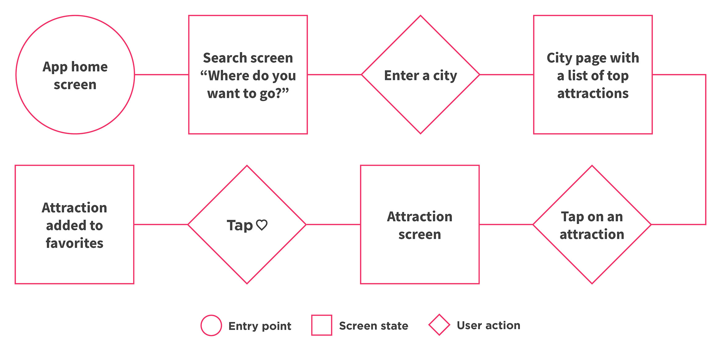
The task flow below represents the happy path a user would take while using the app. One of the goals of the app is to allow users to find attractions quickly. Following the happy path, a user only needs to take three actions in order to find an attraction and add it to favorites.
DESIGN AND TESTING
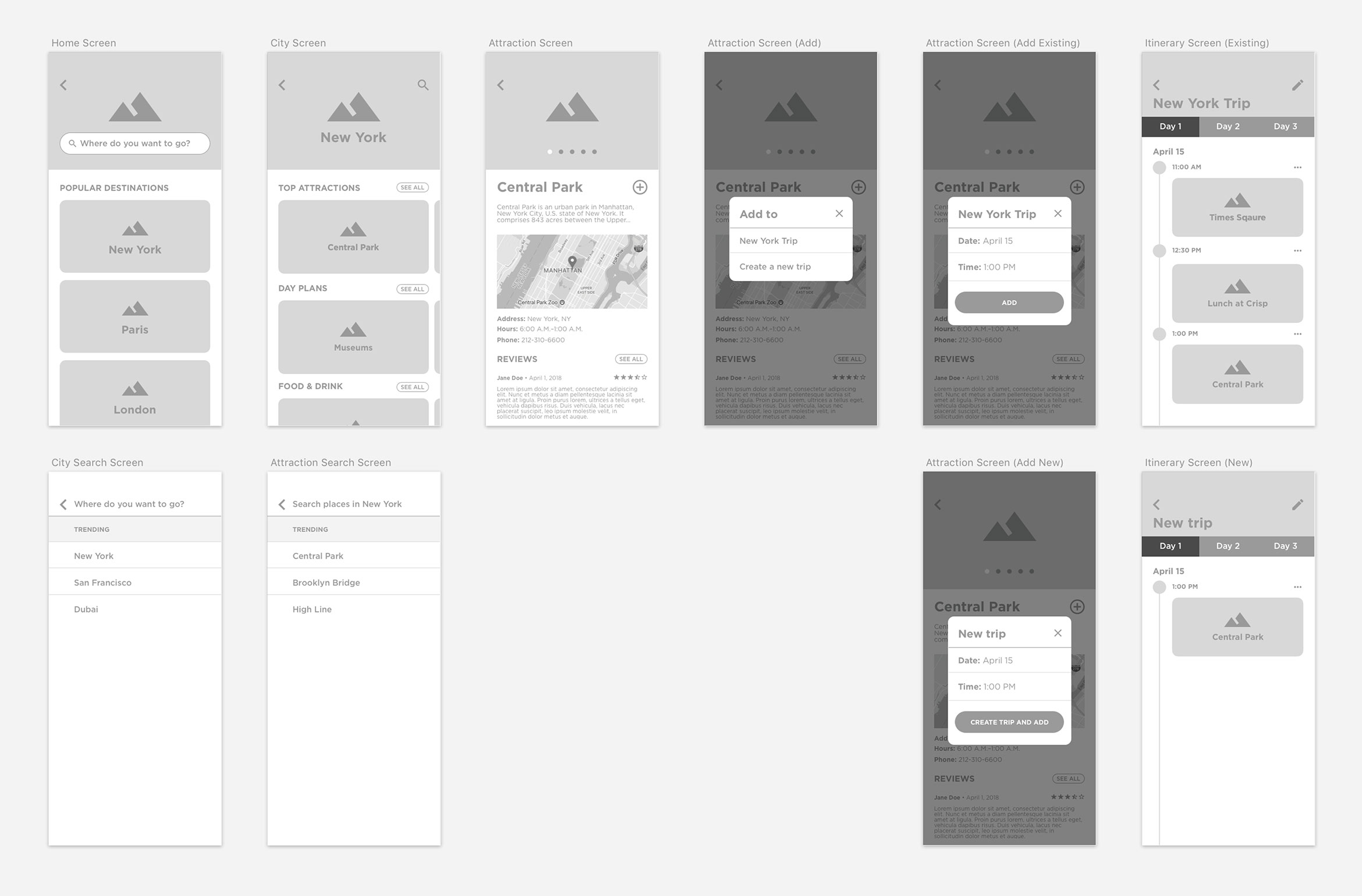
Initial Wireframes
Below is the initial set of high-fidelity wireframes.
Usability Testing
I used the wireframes and created a prototype of my app using InVision. I then conducted usability testing using the InVision mobile app and got some great feedback.
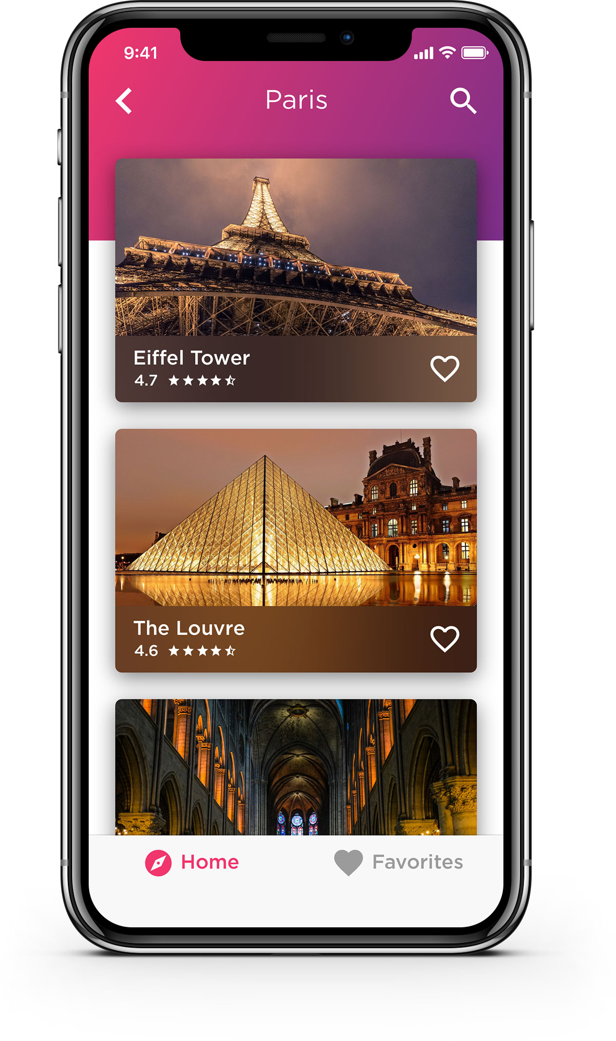
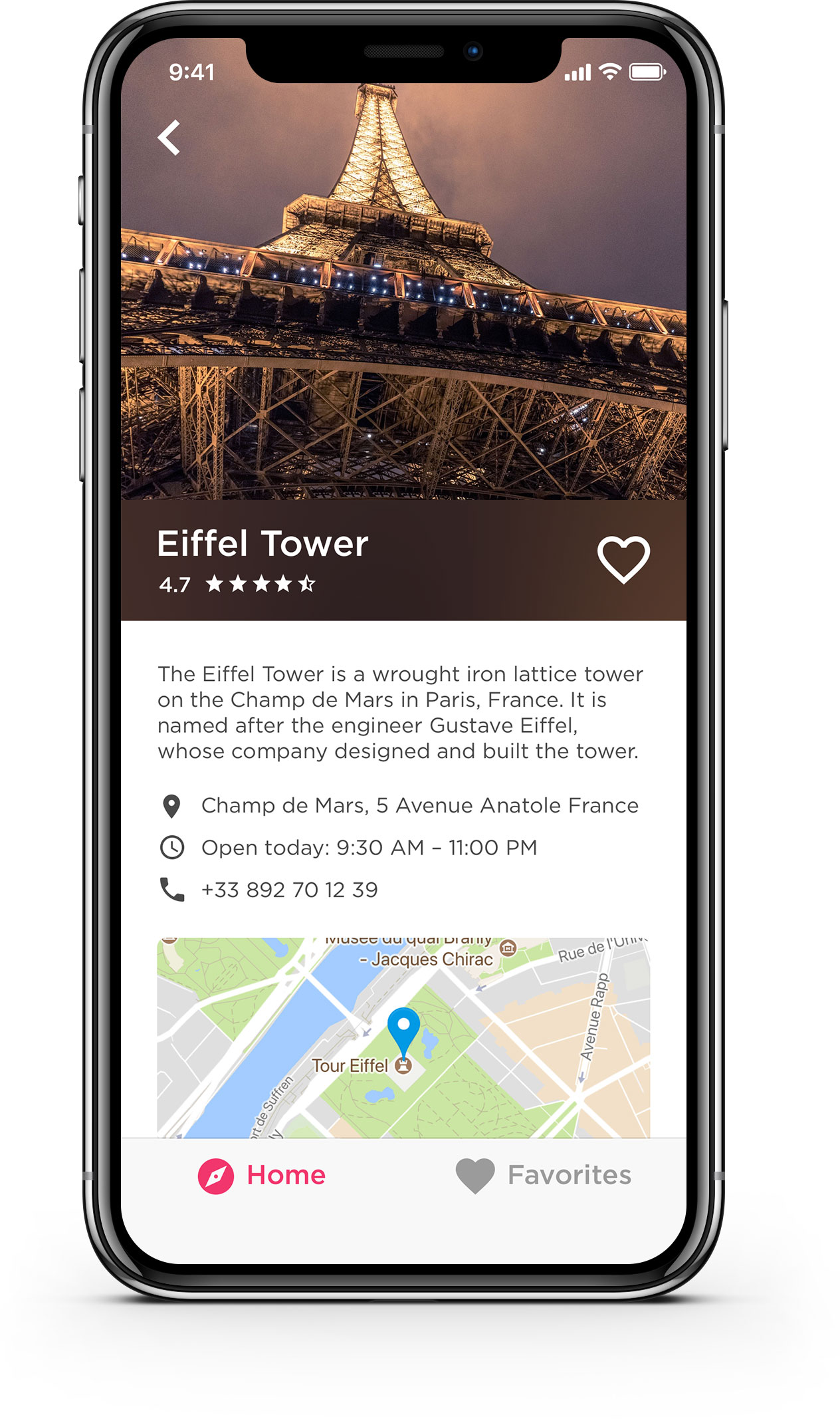
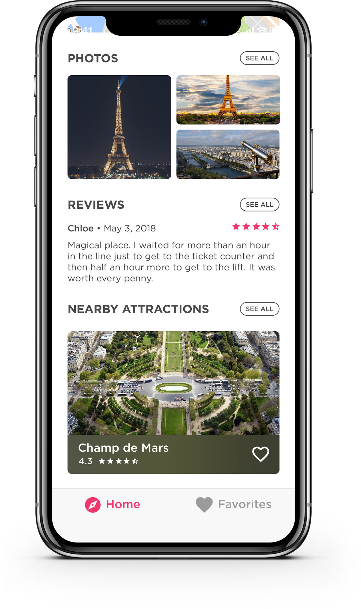
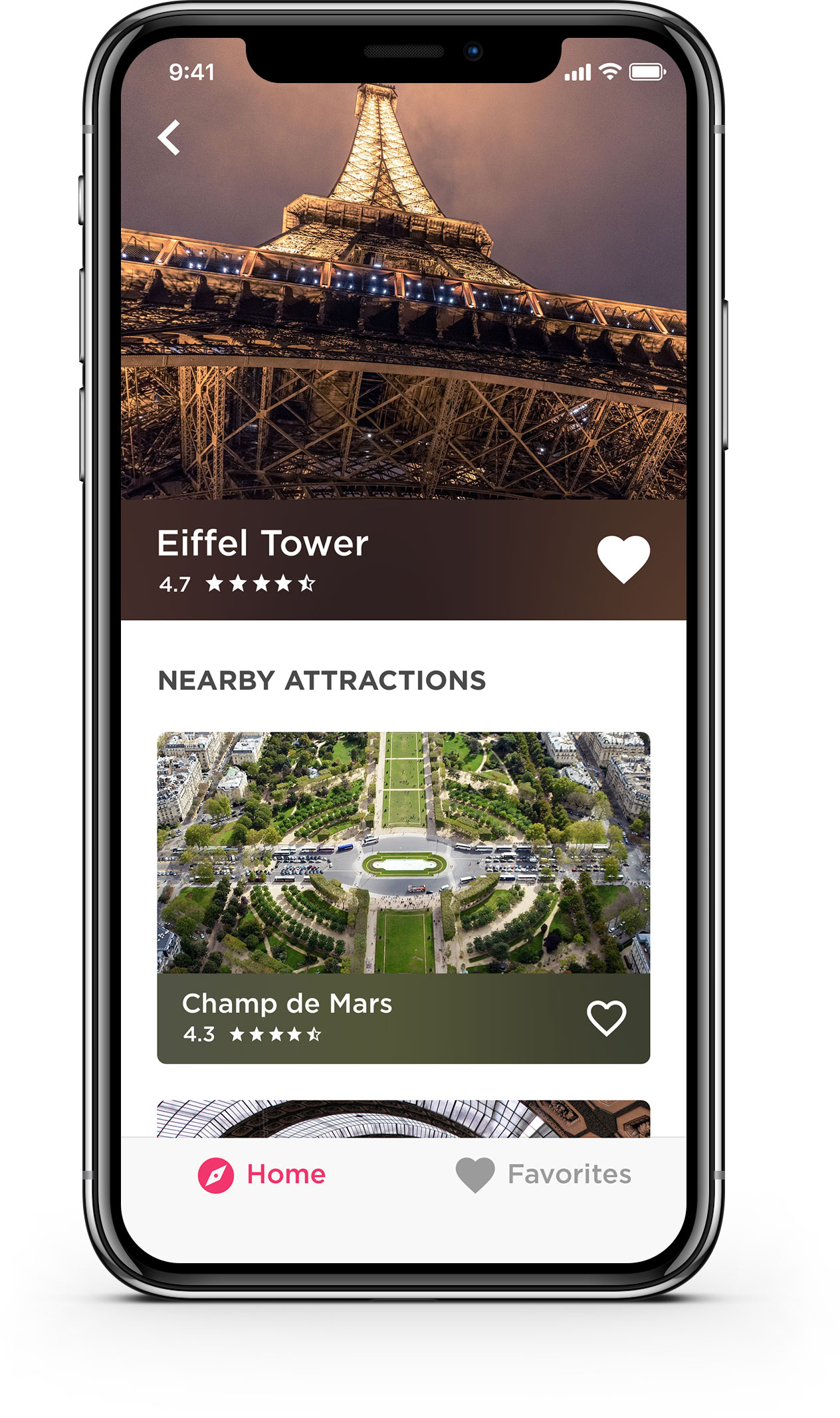
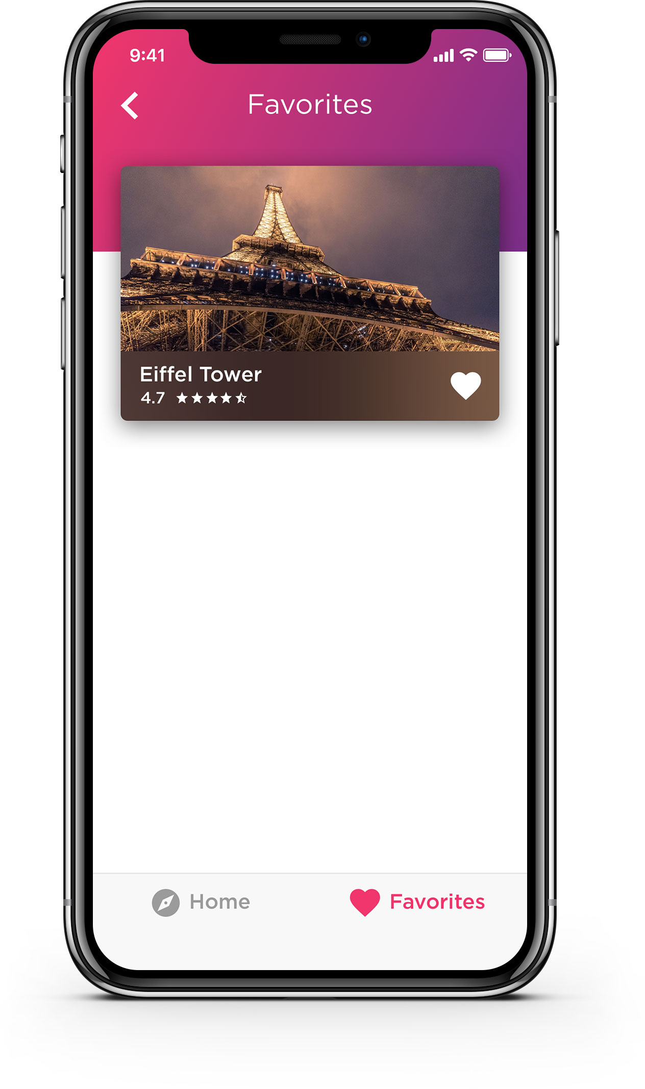
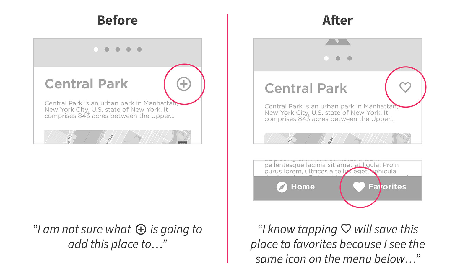
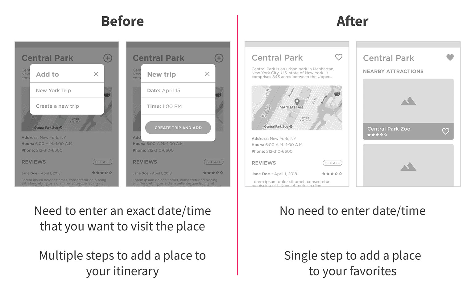
A recurring feedback that I got was regarding the + button on the attraction page. The + button was meant to add the attraction to the itinerary, but people told me that they were not sure what it was going to do / what it was going to add this attraction to. So the solution that I came up with was to use the ♡ icon instead of the + button. I then also used the same ♡ icon on the navigation bar at the bottom.
Originally, the app had an itinerary feature, which included a date and time of when a user would visit an attraction. During the usability testing, people told me that they often don’t know when they would visit a place. Therefore, I got rid of date and time fields. I also renamed the itinerary feature to favorites.
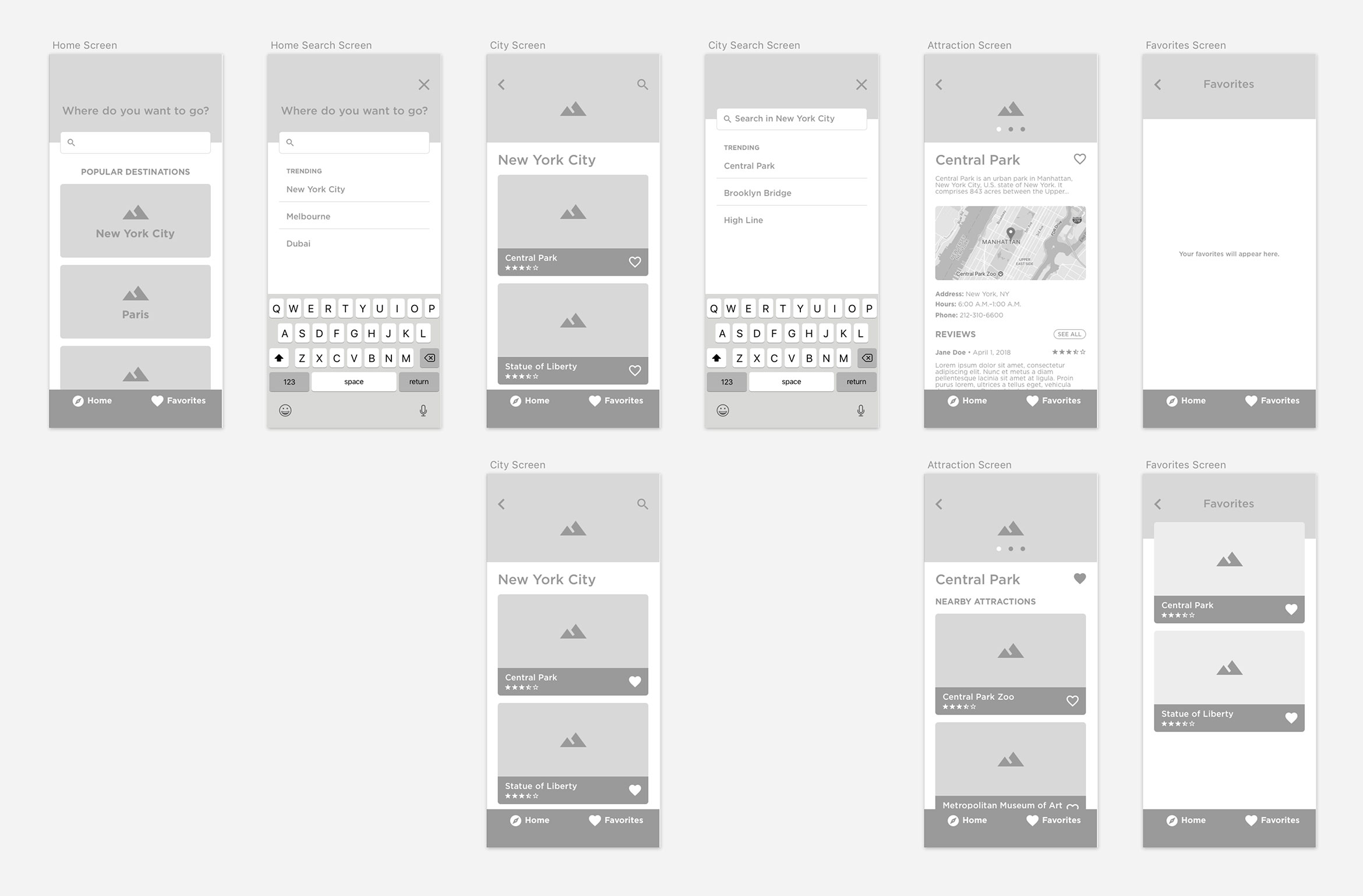
Updated Wireframes
Below is the updated set of high-fidelity wireframes reflecting the changes made after usability testing.
Prototype
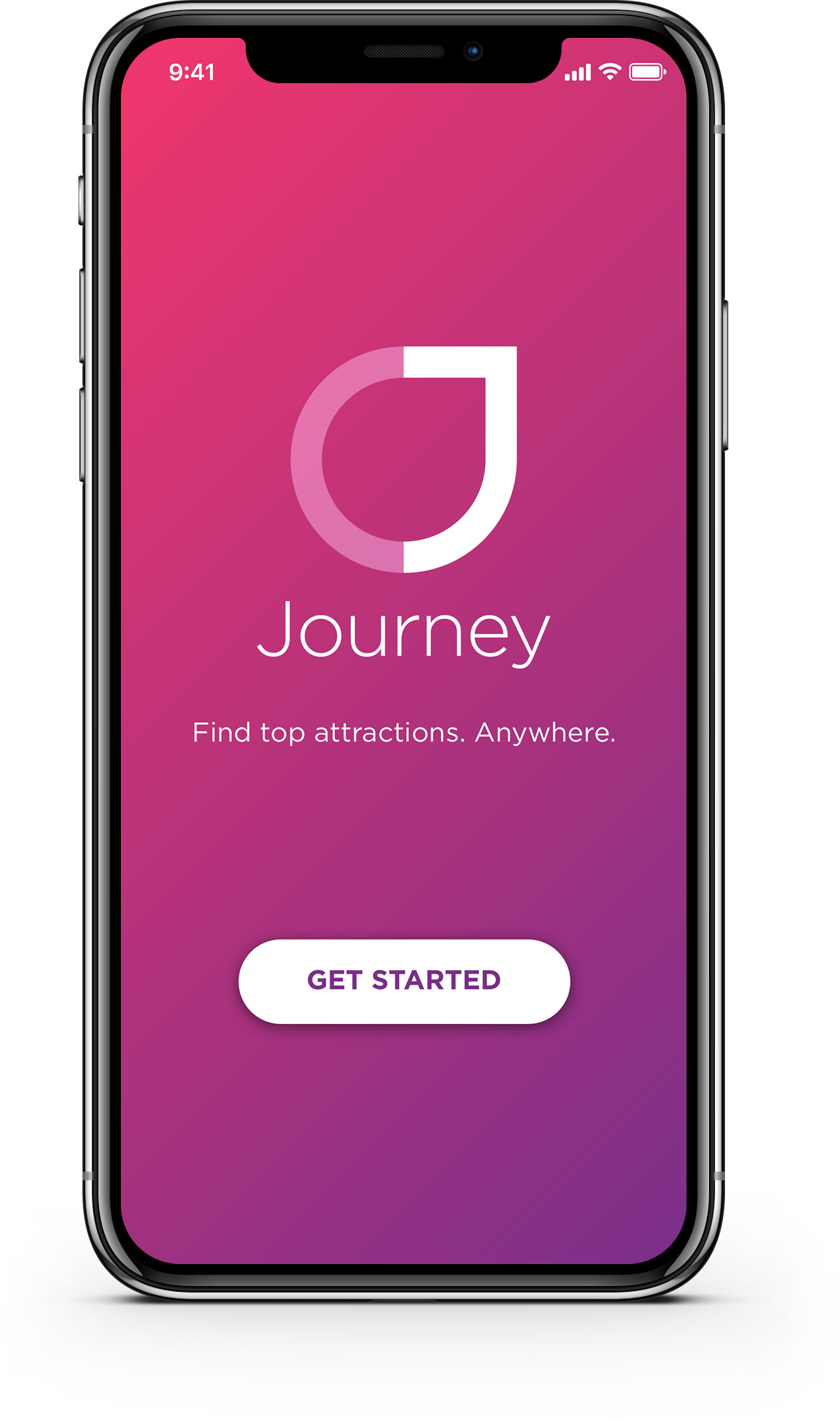
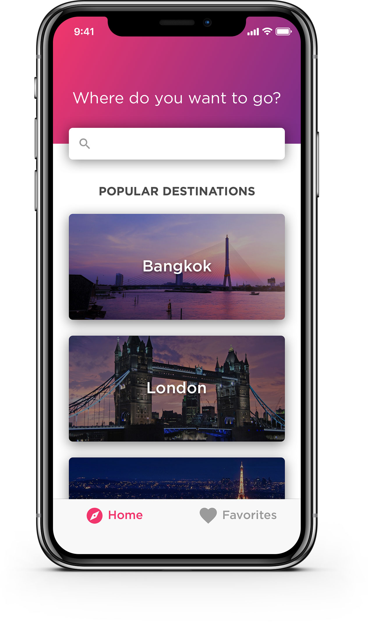
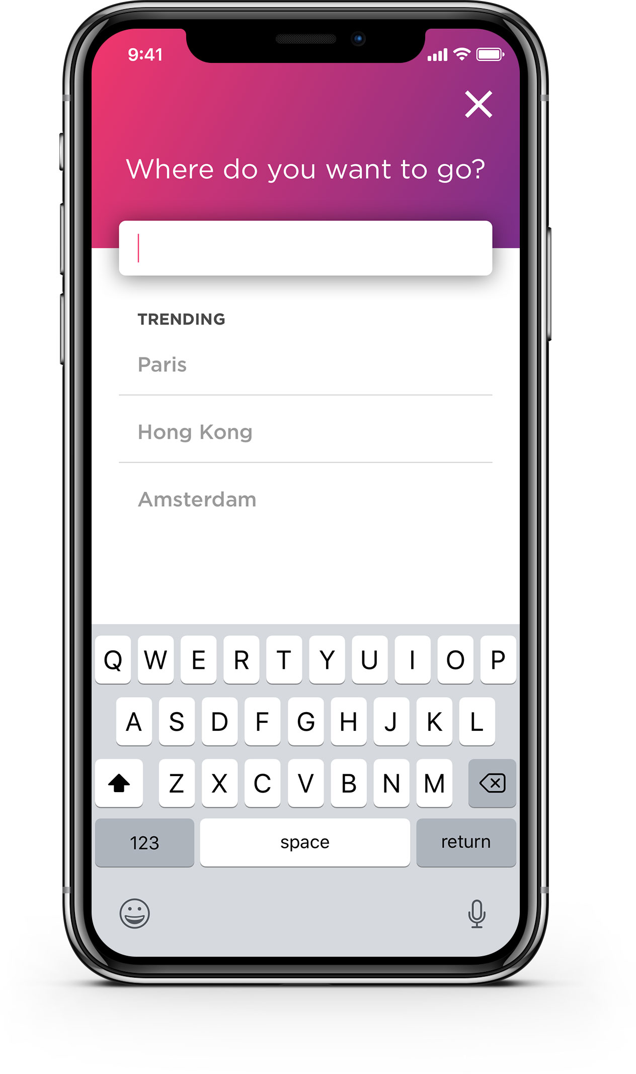
Before designing the user interface of the app, I came up with a logo and a color scheme for the app. I then designed the user interface and created an InVision prototype. Below are the main screens of the app.